.png_width=400%26height=200%26name=Untitled%20design%20(90)%201.svg)
Why most paint colors fail on a lake house (and what to choose instead)
The best paint colors for a lake home are not just the blues, greens, and browns that mimic the scenery. The most successful and beautiful lake house color palettes are strategically chosen to manage the unique, intense light reflected off the water, ensuring the home complements—rather than competes with—its stunning natural backdrop.
The biggest mistake homeowners make with lake house paint colors
For over 20 years, I've seen countless homeowners approach painting their lake house with the same logic they'd use for a suburban home. They pick a color they love from a small paint chip under the fluorescent lights of a hardware store. The goal is simple: find a beautiful color. But a waterfront property isn't a normal environment. Its greatest asset—the shimmering, expansive view of the water—is also its greatest design challenge.
The surface of a lake acts as a massive, constantly moving mirror. It doesn't just reflect light; it magnifies and scatters it, bathing your home's exterior in a cool, blue-tinted, and incredibly bright wash of ambient light. This intense, reflected light is the primary reason why traditional house paint color choices often go wrong. A lovely beige can look washed out and yellow, a subtle gray can turn into a flat, lifeless cement color, and a cheerful blue can look jarring and artificial against the real thing.
Beyond 'blue for water': Understanding how to choose paint colors for a lakeside home
The common-sense approach is to pull colors directly from the environment. As designer Joanna Gaines notes for her own lake house project, the goal is often that the "color palette has to feel seamless to what I'm seeing on the outside" according to The Spruce. This is a great starting point, but it's crucial to understand how to translate that inspiration into a successful paint job.
Let's compare the different strategies for developing a whole house paint palette for a lake home:
Simply Mimicking Nature's Colors
The Idea: Matching colors directly—sky blue for the siding, forest green for the trim, and sandy brown for the deck.
Pros: It's an intuitive and safe approach that guarantees the colors won't clash with the environment.
Cons: This method fails to account for reflected light. The colors often appear flat, overly bright, or cartoonish because they lack the depth and complexity of their natural counterparts. The home can fade into the background rather than complementing it.
Complementing the Surrounding Landscape
The Idea: Choosing colors that harmonize with the shoreline, trees, and sky, such as a deep navy or a rich forest green.
Pros: This creates a classic, cohesive look. A Cape Cod-style home, for instance, can be painted a deep navy blue with green undertones like Farrow & Ball's Hague Blue to blend seamlessly with the surrounding landscape. This approach shows more design intent.
Cons: Even these beautiful, rich colors can be flattened or distorted by the intense lakeside light if the specific undertones aren't carefully considered. A navy without enough depth can look like a bright royal blue in the midday sun.
Strategically Managing Reflected Light
The Idea: Selecting complex, muted colors with shifting undertones that absorb and interact with the intense, cool light, looking beautiful in all conditions.
Pros: This is the expert approach. The home feels grounded, sophisticated, and perfectly suited to its environment. The colors reveal new depth as the sun moves across the sky, preventing the dreaded "washout" effect.
Cons: It requires a deeper understanding of color theory and is less straightforward than simply matching colors. It's often where the guidance of a professional painter with specific lakeside experience becomes invaluable.
The 'chameleon effect': Colors that thrive in shifting light
The secret to managing reflected light lies in choosing colors that have depth and complexity. These "chameleon" colors contain a mix of pigments—a gray with green and brown undertones, or a green with a heavy dose of gray. This complexity prevents the light from washing them out, allowing them to shift beautifully with the changing daylight and seasons. These are the top paint colors for selling a lake house because of their timeless and sophisticated appeal.
Gray-Greens and Complex Sages
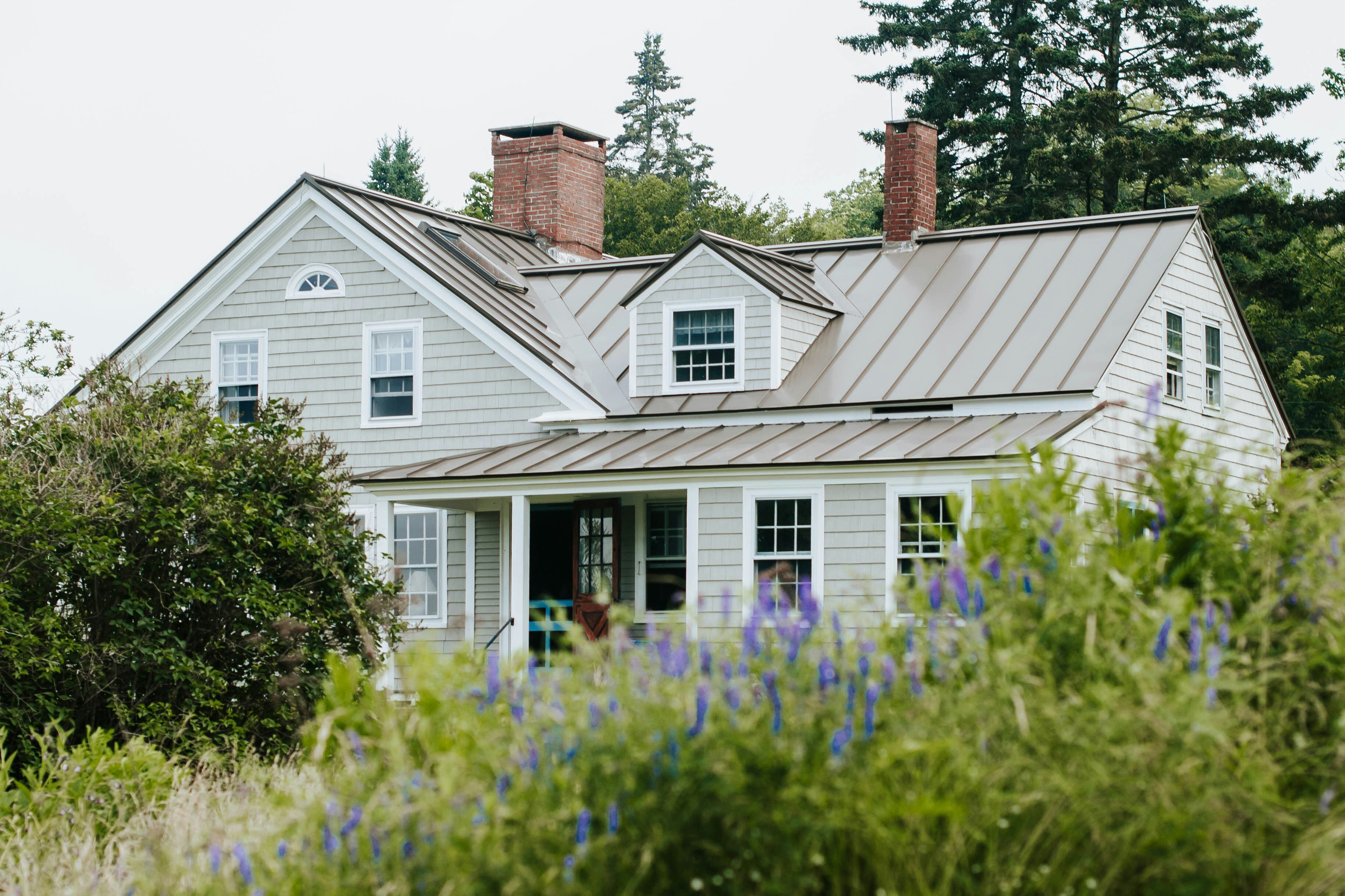
These are perhaps the most successful colors for lake houses. They connect directly to the surrounding foliage without being a literal "forest green." A color like sage green, which is an earthy and muted green-gray color with yellow undertones, feels both natural and sophisticated. For a lakefront home, an earthy shade of green with a subtly grayish cast, like Benjamin Moore's Kennebunkport Green, can add definition while blending in with the natural surroundings. Other fantastic options in this family include Sherwin Williams' Sea Salt (for interiors) or Benjamin Moore's October Mist.
Earthy Browns, Taupes, and "Greiges"
Connecting to the stone, soil, and tree bark of the shoreline, these warm, earthy tones provide a solid anchor for a home. They are perfect for a lake house with a stone exterior or for rustic lake cabin interior paint ideas. A "greige" (a mix of gray and beige) like Sherwin Williams Agreeable Gray or Benjamin Moore Revere Pewter offers warmth without turning yellow in the sun. These are some of the most popular neutral paint schemes for lake houses for good reason—they are timeless and provide a perfect backdrop for natural wood trim.
Deep Charcoals and Moody Blues
For a more modern or dramatic look, don't be afraid of dark, moody paint colors. A deep charcoal like Sherwin Williams Iron Ore or a rich, complex navy like Benjamin Moore Hale Navy can be stunning. These dark colors absorb the light rather than reflecting it, creating a powerful, grounding presence that makes the green of the trees and the blue of the water pop. They create a beautiful contrast that feels intentional and high-end, making them a cornerstone of many a modern lake house color palette.
Key factors for your waterfront property paint colors
Choosing the right color is more than just picking a shade. It’s a balance of science, environment, and personal taste. Here are the critical factors to weigh for your lake house renovations.
Interaction with Intense, Shifting Natural Light
This is the most critical factor. Remember that exterior paint colors often appear several shades lighter when applied to the entire house. Always buy samples, paint large swatches on different sides of your house, and observe them at various times of day—morning, noon, and dusk. What looks perfect on a cloudy morning might be blindingly bright at 2 PM. As one client noted, "Mike's knowledge and expertise were evident—he wasn't just going through the motions. He took the time to understand our needs and ensured the finished product was exactly what we envisioned." That understanding of how light works in a specific location is key.
Harmony with the Natural Environment
This is what I call the "View from the Boat" Principle. Don't just assess your color choices from the driveway; if possible, look at your home from the water. Does it harmonize with the shoreline, the tree line, and the sky? Does it nestle into its surroundings or stick out like a sore thumb? Your home is part of a larger landscape, and the best exterior paint color combinations for lake houses respect that relationship.
The Home's Architectural Style
The color must fit the house. A modern lake house with clean lines can handle a bold charcoal or a crisp white with black trim. Cozy lake cabin paint colors might lean toward warmer, earthy tones and exterior stain colors that celebrate the wood. A classic lakeside cottage might call for a timeless navy or a soft sage green. The goal is to enhance the architecture, not fight it.
Durability and High-Humidity Performance
A lake house faces unique environmental challenges: high humidity, moisture, and intense sun. Choosing the best paint for a high humidity lake house is non-negotiable. This means a high-quality acrylic latex paint with mildew-resistant additives. The paint sheen also matters; for interiors, a satin or eggshell finish offers durability and is easier to clean than a flat finish, which is important in humid environments. For exteriors, a satin finish provides the best combination of durability and aesthetic appeal.
The finishing touches: Strategic accents for doors, trim, and shutters
Committing to a muted, complex neutral for your siding doesn't mean your home has to be boring. Accents are where you can inject personality and vibrant color without overwhelming the landscape. Your front door, trim, and shutters are the perfect canvases for a pop of color that reflects the environment in a more direct way.
Consider these lake house front door color ideas:
- A deep cranberry red that echoes the changing leaves in autumn.
- A warm, golden ochre that captures the feeling of a sunset.
- A rich, deep-water blue that provides a nautical nod without being cliché.
- A crisp, clean white for trim (like Benjamin Moore Chantilly Lace) to create a sharp, classic contrast against a darker body color.
Answering your top questions about lake house paint colors
What are good colors for a lake house?
The best colors are complex neutrals that can handle intense, reflected light. Think of gray-greens, earthy taupes, warm "greiges" (like Sherwin Williams Repose Gray), and deep charcoals. These colors have depth and change beautifully throughout the day.
What are the trending colors for a lake house in 2025?
Looking at popular lake house paint colors, the trend is moving away from cool grays and toward warmer, more organic tones. Expect to see more earthy greens, warm off-whites, rich brownish-charcoals, and sophisticated deep blues. The "coastal grandmother" trend has also influenced serene and calming paint colors for lake house interiors, focusing on light and airy palettes.
What are the three paint colors that will never go out of style?
For timeless appeal, you can't go wrong with these three categories:
- A Complex Off-White: A soft, warm white like Benjamin Moore Swiss Coffee avoids the sterile look of pure white and provides a bright, classic backdrop.
- A Versatile Greige: A color like Sherwin Williams Agreeable Gray or Benjamin Moore Revere Pewter is the perfect chameleon, blending with both warm and cool tones and appealing to nearly everyone.
- A Deep, Classic Navy or Charcoal: A sophisticated anchor color like Benjamin Moore Hale Navy provides timeless contrast and a sense of permanence and quality.
Making the right choice for your needs
Ultimately, the "best" color is the one that achieves your specific vision for your property. Here’s how to narrow down your choices based on your primary goal.
For the Nature Purist
If your goal is to make the home a seamless extension of the landscape, focus on the most organic, earthy lake house color palettes. Your best choices are muted sages, mossy greens, soft stony grays, and warm taupes that mimic the surrounding woods and shoreline. You want colors that help the home recede gracefully into its environment.
For the Statement Maker
If you view your lake house as a showpiece, aim for sophisticated contrast. A deep, moody color like a rich charcoal or a dark bronze will create a stunning, modern backdrop for the vibrant blues and greens of the lake. Alternatively, a crisp, architectural white with black trim can create a striking, clean look that feels both classic and contemporary.
For the Practical Renovator
If your focus is on timeless appeal, durability, and maximizing your home's value, stick with proven, versatile neutrals. These are the top paint colors for selling a lake house. A sophisticated greige, a warm off-white, or a classic taupe will stand the test of time and provide a beautiful, welcoming canvas that appeals to the widest range of potential buyers.
Choosing the perfect paint color for a lake home is a decision that impacts not just curb appeal, but how you feel in the space for years to come. It requires a unique blend of artistry and technical knowledge. A professional approach ensures every detail is considered, from the specific undertones of the paint to the long-term durability against the elements. A recent customer's feedback highlights this perfectly: "His prompt communication, video proposal, and meticulous care exceeded expectations. Mike’s respect for our home and commitment to quality made the process seamless." At Mike Walsh Painting & Decorating, we bring that same level of expertise and meticulous care to every project. If you are looking for a painter in Wisconsin or the surrounding areas, contact us for a free, comprehensive consultation to find the perfect color palette for your lakeside retreat.